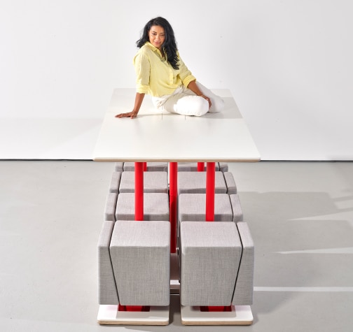
CUBA HUBSTATION : DESIGN STORY
the design inspiration behind the cuba responsive furniture system
THE BEGINNING

James Lucas – Designer
_When designer James Lucas of spliced studios set out to create his vision of Responsive Furniture, he didn’t just have one thing on his mind. oh No! He had a whole shopping list.
"I wanted to create a responsive product that was as stripped back and minimal looking as possible, yet didn’t lack functionality"
James Lucas
time flies when you’re having fun
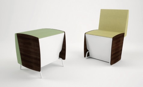
first ever render – responsive furniture is born!
James first came up with the original concept of Responsive furniture 10 years ago. the first responsive products looked and worked very differently. through his learnings he realised to maximise the benefits of responsive seating, it needed a product system.

A responsive seat needed a responsive table.
One that had to be designed in conjuction as a unit. This was the springborad for the cuba responsive furniture system.
THE BRIEF
cuba’s inception started life out as a long list of criterias. apart from being super pared back and minimal, there were lots of other important design considerations.
Nested Table
It had to work with a table (especially a square one). His vision was something that when nested together they formed a clean simple shape without backrests sticking out.
Tessellation
That it could tessellate with itself and the table like Tetris. Fitting and working perfectly together and apart.
Mobile
The seat had to be highly mobile, so that you could move it around freely and easily.
Omnidirectional
It was important that the responsive seat was omnidirectional just like the stool it was based on. That it didn’t have a obvious front or back, so it could be placed in a room and not look like it was pointing in a certain direction.
Comfortable
It went without saying it was imperative that it was comfortable. Otherwise there would be no point of a responsive seat turning into a chair, if it wasn’t comfortable.
Product Variants
To offer a truly integrated flexible system it was important that other product variants could be added easily. Whether static versions of the seats or larger, wider, taller sizes.
_forget everything you know
James used first principles thinking to tackle the challenge. he re-evaluated the relationship between a chair and a table in order to start from a clean slate. he spent the next 5 years exploring and developing hundreds of designs and prototypes. one form stood out.
FIRST PRINCIPLE THINKING

The act of boiling a process down to the fundamental parts that you know are true and building up from there.
CUBA SYSTEM WAS BORN
BLOCKWARDS AND UPWARDS
_the geo-metric cube design was one of the key features that enabled james to unlock the functionality he was after in the cuba system.
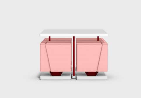
Designed as a unit, the simple cubic styling allowed the chool and the table to integrate together like no seat and table had done before. becoming more than a table and chairs. it became a hubstation.
_nested table
The block form of Cuba Chool was key to creating the clean cuboid shape of the hubstation. The sheer flat sides of the seat, almost brutalist in aesthetics ensured that nothing stuck out from the table.
_tessellation
Cubes are the simplest forms to tessellate.The flat edged Chools could easily tessellate with one another forming benches and other shapes. It also inspired James to create a clever docking base so that the seat and table could dock together. This helped the table to self organise as well as make height adjustable tables easier to use.
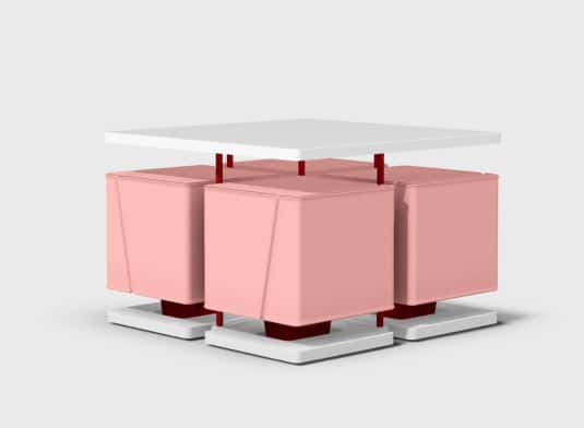
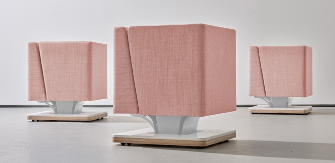
_omnidirectional
The block design was instrumental in creating a responsive seat that could face any direction when not in use. The geometric uniformity allowed Chool the freedom to be left scattered in open space without looking out of place .
_mobile
The Chool’s square hoverbase cleverly hides the castors. Breaking away from the office chair vibe that existing chairs with castors look like.
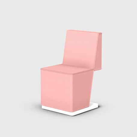
_comfortable
It’s not often cube and comfort go hand in hand. So the flat backrest design chosen to keep it as aesthetically simple as possible, might have felt counter-intuitive. With that in mind, he was insistant comfort wasn’t scarificed. Otherwise, it would defeated the whole purpose of Responsive Furniture if it couldn’t turn into a comfortable chair.
Luckily, learnings from early prototypes helped him walk this tricky tightrope. Enabling James to optimize the height, the angle and what foam to use to achieve a supportive backrest. All together the final design balances the need for that simple minimal aesthetic with comfort for the user.
_other product variants
Having the ability to expand the product range was one of the design requirements set right at the very start. Athough Cuba currently only has one size of responsive and static products, the cubic style offers the flexibility to add more product variants in wider, taller sizes. Even bench like products can be created all without restrictions. Unfortunately no other shape could come close to the versatility of the cube. Even slightly softer cubes with scallops cut into them disturbed the overal minimalist look around the table and not to mention the difficulties around extending the range with them.
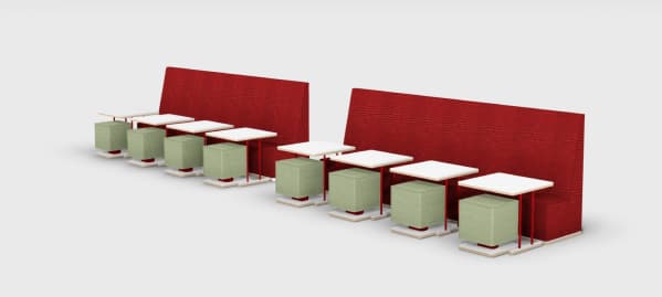
the final cuba design
so now you know why cuba is so...cube-y
in a way cuba isn’t realy about how aesthetically pleasing the block form is, but about something much purer.
Cuba is really about trying to get to the very essence of what responsive Furniture is. it’s about Stripping away everything distracting to see what the ground zero of responsive furniture looked like. And from what we can see it looks like a very exciting place. cuba is just the start.
